Thursday 26 November 2015

Value Range: Initial Designs

I decided to go with approach two: Saving money because I feel that this is most appropriate in the current financial climate. "Saving you money for the things that matter" could be a potential slogan or at least the point in the brand, it implies that there are more important things than what brand you buy. Through redesigning the products I hope to change perceptions anyway as I think people will consider a package if it is designed nicer. 

After mind mapping I came up with the name Savor, however I will change it to Savour to fit with the English spelling. Savour means enjoying food to the full, good quality and taste this will help to produce positive connotations around the cheaper range. It's also a play on words as it sounds the same as 'saver' showing that people will save money through buying the products.


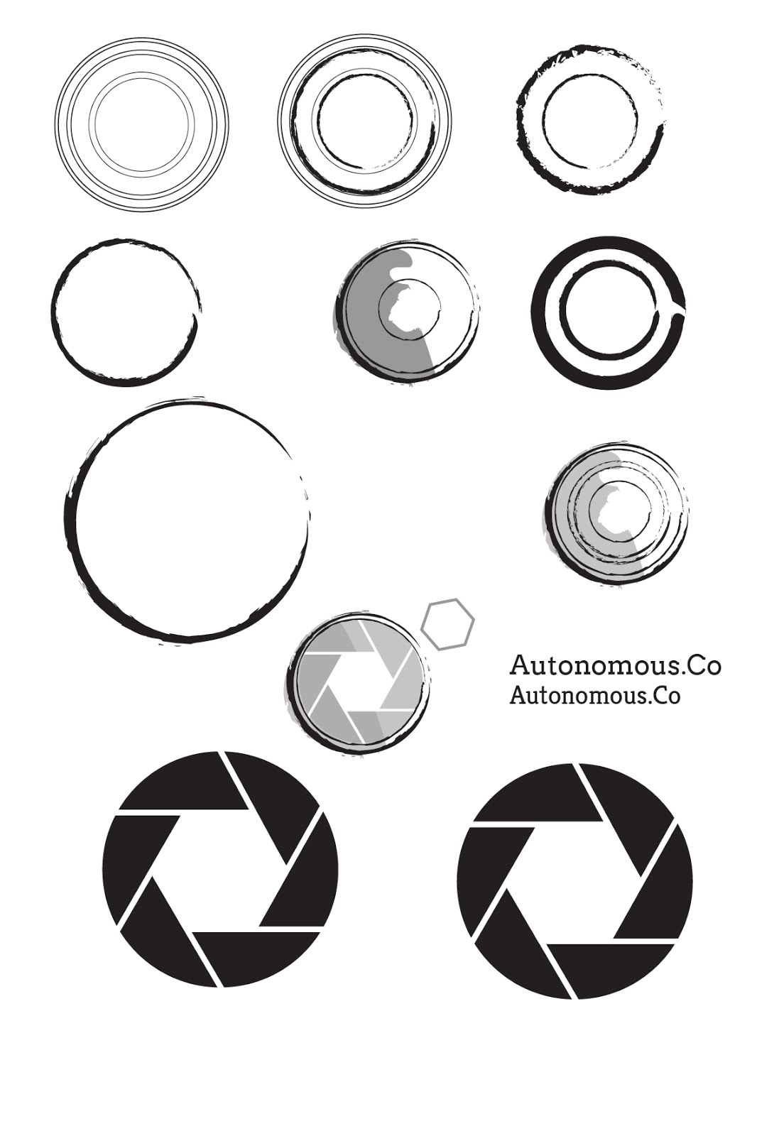
I mocked up a few different logo ideas taken from my sketches playing around with different shapes. The logo needs to be quite simple and work in either just black or black and orange so that it is cheap to print and can be applied to a range of different
products. The first font I experimented with is called Montserrat (far left designs), however I think this is too heavy and geometric for Sainsburys, it doesn't fit their market and stands out further than the rest of the design. I decided to change it to Linux Biolinum O (the other font), this works a lot better as it is gentler on the eye and the shape of the letters is more sophisticated. This works a lot better and fits in more with the sainsburys style.


I quite like the idea of choosing the products to redesign that would make a meal. For example I could do a fry up and redesign the beans, bacon, eggs, bread, etc... that all make up the fry up. Then for the final picture I can show them all and write how cheap it would be to make a fry up with Sainsburys Savour Selection.


I began applying the logos to a mock tin of beans to see how it would work in practice and what looks best. I wanted to use imagery because it reassures shoppers of the quality of the product, even though baked beans all look the same. The first font I tried for Baked Beans (top left design) is called Note This, initially I quite liked the hand rendered approach making it look more personal and hand done. It is equally similar to the current font Sainsburys use in their basic range, however it isn't very clear especially from a distance, it is too light. Instead I decided to keep the design in the same type family and use Linux Biolinum O again but in bold for the product and italic for the detail underneath. This has worked a lot better as it ties both elements of the design in together making it clearer and easier to read from a distance. 

For the last design (bottom right) I deleted the shape which held the type in and just let the type speak for itself, I think I prefer this design as it looks less constricted and slightly more up market. I decided to play around with an illustrative style instead using simple shapes with a lower opacity so that the overlaps would show and it would be clear that they are beans. 


I decided to take the last design further and experiment with the structure of it. Firstly I added steam behind to try and remove some of the white space however I am not sure if it is clearly steam or perhaps just a mystery grey mark. I also tried adding orange bars either end of the tin which would go around the whole of it, this could be done on every product to tie them all together and also to make it clearly Sainsburys. I'm not sure what I think about this as it might just take up space and squish the design down but I will keep it open as a possibility for now. 

I also tried applying the design style to a tin of peas to see if it would work on a range of different products. The nutritional information needs to fit on the tin as well but I am not sure whether this necessarily needs to be on the front or whether I can get away with hiding it on the back. On the front I think it just distracts from the design.


CRIT
These were the three boards that I presented at the crit, I got some useful feedback and opinions. It was good to hear I am on the right track and it has given me more to think about. Below are some points that were said:

• Perhaps try designing just in one colour or 2 to cut down on printing costs
• Pick 5 colours to use throughout the value range designs for different produce
• Logo in shape looks a bit like Hovis but this could be good playing on brand recognition
• Linux Biolinum O as a font is on point for this design
• Maybe work with illustration over images as it will be cheaper to print


NEXT STEPS
• Think of a meal to rebrand 
• A colour palette that will work across a broad range of produce
• Buy some products and look at how the information is structured on back

Tuesday 17 November 2015

Value Range: Sainsbury's Design Studio - Own Label

Before designing I wanted to do some research into Sainsburys designs in the past. In the library their is a book which is literally Sainsbury's past designs, I felt this was a good place to get inspiration from.


The repeat pattern on the crispbread packaging caught my eye as it is a simple way to show the product without having to print images.


I liked the use of images to form a pattern, with the information following the lines of the food. 


There were a few different cereal box designs that really reflect the culture of the time. My eye was drawn to the far right one which uses an fine line illustrative style.


I liked the fish illustrations and how they overlap, I want to experiment with overlapping illustrations.

Simple illustrations and use of 2 colours to produce a design is something that I want to try as it would be cheaper to print. I also quite like using the glass as an outline on the right page, this could work as an idea - having the food in to form the outline and then text on the inside.


The thing that caught my eye here was the joining pattern on the greaseproof paper, it would be good to create packaging where the design links on to the next product as this would be more eye-catching and interesting.

Thursday 5 November 2015

Autonomous.Co: Making the Gif

The guys were pretty clear with what they wanted so that cut out researching for different ideas and lead straight to designing. Originally they wanted this gif to be their logo but I advised them against it and suggested the logo should be a separate, non moving entity, mainly because it would be too detailed and complex for the logo but would work well as a complimentary gif which could be put at the beginning of their videos.

I started by creating a simple outline for a polaroid camera. The polaroid image I created separately and using artboards I was able to move the print out down the screen in equal segments, the rest of the polaroid was deleted so that it looked as if it was being printed. I used Photoshop last year to make a gif so I had a rough idea of what i was doing and how to use the software. 


Above are all the separate images in lines so that you can see the progression and what images the gif will use. I quite like this layout in itself as an extra piece of design, perhaps a poster, that could be used to promote Autonomous.Co.


This quick clip was my first attempt, I wanted to make it into a Gif and send it to them before I did anymore to it to check it was along the right sort of lines. Whilst it is a basic rough draft it shows enough to demonstrate the style it would be in.


 They were happy with how the gif had progressed so far. I originally worked on the gif before beginning the logo and got it up to this point. After finalising the logo that they wanted to go with I was able to adjust the gif to harmonise with the logo's style. The solid lines were replaced with a rough pencil line to match the logo. There were two extra things that they wanted: firstly for the image to be printed to have something on it, they either wanted a city or some mountains. I suggested a city outline and chose Leeds as this is where they are filming so it makes sense and ties in a lot better to the design. The second thing they really wanted was a flash to go off before the image printed, I was quite unsure how to go about creating this so sketched it out before working on it digitally.


The simplest way to create the flash seemed to be using a white rectangle that would come out from the flash and grow bigger until eventually the screen is completely white. The shape couldn't have a harsh outline as it wouldn't fit with the design or the nature of the flash, I used another artistic brush to create an outline around the flash which removed the neat, straight edges.


Above shows all the artboards as one, showing how the flash develops and the cuts out allowing the image to print. I used a coloured background so that the flash would be visible.


Here is the final gif, the separate images feed into each other well however I am still unhappy about the images jumping about. I really struggled to line the images up exactly, I am not sure if there is an easier way to do this that I am yet to discover. I send it to them anyway and they quite liked the jumpy nature of the gif, it fits in better with the style of the gif and logo. 

Tuesday 3 November 2015

Autonomous. Co: Logo Research

Before I begin designing the logo I wanted to carry out some visual research into exisiting companies logos to see what it already out there.  All the logos work in black and white and involve a simple vector graphic - predominantly a film strip. I really want to try and avoid this look as I feel it has been over done, it is an obvious logo. 


Handmade is my favorite logo because of the clever combination of the hands and the film strip to express the company.


Also the logos are neat and clearly defined, I want the Autonomous logo to have a more creative and hand made aesthetic. I feel that this would be more reflective of their practice - it isn't neat and refined it is experimental, messy and creative.

Value Range: Mindmapping


I first started by writing a mindmap of everything around value products. Different reasons why people may not use them such as they believe they comprimise quality and that they are cheap. I want to outline the reasons I think people don't buy value products so that when I conduct my research I can compare my findings with my original theory. 

Currently I think there are a couple different reasons why people have negative views on the value products:

1. Cheap The packaging looks cheap and this reflects the product inside, people don't want to sacrifice quality.
2. Taste I think people believe there is a huge difference in taste between the value range and the slightly more expensive alternatives 

Both of these issues stem from the packaging design. People rely on the packaging to judge the quality of the product inside, if the packaging looks cheap and low quality then the product will be viewed the same way. Taste again, I think has a lot to do with visual perceptions when you try a product with nicer packaging it tastes better compared to the same product in cheaper packaging. Blind taste tests shows that the split between value and brand is around 50/50 compared to when the packages are shown and the brand preference jumps up to 80/20.


After my initial research into mumsnet and online articles I mind mapped possible solutions and different ways of approaching the brief. I noticed a few running themes which I have colour coordinated into three different approaches.


Approach one: Changing perceptions
My first idea to spark from this was to try and change people's perceptions around value products. Instead of being viewed  as cheap and poor quality, people could view them as a bargain. To do this I would have to show that there is no real difference between the value and the brands.

Approach two: Saving money
I noticed a lot of mums online wrote about how they have started using basic range products to cook meals from scratch as it is cheaper and no-one can tell the difference. Most people are looking for a way to cut back on spending and the value range is perfect for this market. On average a family saves £850 a year if they downshift to a cheaper brand, that is so much money saved without having to sacrifice flavour or quality. This approach could work well playing on the idea that people would have money for the stuff that matters.

Approach three: No difference in taste
Money Saving Expert found that there were no nutiritional differences in a large amount of the value products and a lot of people online wrote how products were 'exactly the same' as their more expensive alternatives. Taste is a big issue with cheaper products so focusing on the fact that the flavour and taste are the same could be a viable option.

I will ask a few people the questions I have prepared in an informal interview setting and see what answers I get. Then I will revisit these approaches and outline what approach I will take.


Monday 2 November 2015

Autonomous.Co: Logo Development


Personal
One of the main qualities that I really like and they were keen to get across is how they are slowing down in such a busy world where we tend to be so fixated on getting somewhere that we don't stop to appreciate the things we overlook everyday. They are taking the time to film someones life and put the light on them, it is personal and builds a rapport with those they film, there is nothing corporate about the company its really about getting to know people.

Fun not Serious
Another factor which I think is important to portray in the logo is that its not serious and corporate; it's two students. However this doesn't mean that the logo should not look professional.


I began by experimenting with circular shapes to represent the camera. I used different artistic brushes to outline the circles instead of a solid line as I wanted to get across the idea of movement. I also wanted to use an artistic outline to make the logo more personal and handcrafted. The plain circles just looked like coffee rings and it wasn't clearly a camera. I simplified a camera's shutter and added this in as an extra dimension, I quite liked the idea of showing a slowed down shutter to represent them slowing down and capturing the lives of people. 


I took this idea further and combined it with the camera circles to create the exterior of the camera. I tried out different shutter settings to vary the size of the white hexagon in the middle, as well as different shades of grey to back the image to add depth to the logo. I tried out a range of different 'hand-rendered' fonts to suit the style of the logo but couldn't find one that I liked. The first one (top left) is completely illegible from a distance, it is way too light and delicate, the other two in the top row are too mechanical and they make the logo look like it should be for a car mechanics. 

I experimented with another idea of a 10 by 10 grid of circles to represent a legion, people working as one single unit - autonomously. However this wouldn't work as a logo apart from the fact that it doesn't grab your attention it wouldn't work on a scale of different sizes, it would be unclear if it was small.


I was struggling where to go with the logo, I still liked the idea of the circular camera capturing as the logo but it still looked too mechanical. After speaking to Ness we both drew up some different ideas to try moving away from the circlular design I had created so far. In the end I still wanted to use the camera shutter idea but it needed something else to make it more relevant to their company. Ness drew brackets around a circle to symbolise the outline of a camera, I digitally mocked this up and changed the stroke to an artisitic brush   


Here is the final logo, In the end I decided to use the brackets around the circle to make the logo look more like a camera, this has worked really well as it has framed the circle giving it context. The implication of a camera is now a lot clearer without adding too much busy detail, the brackets keep the focal point on the central part of the logo. The logo has a messy but controlled, artistic aesthetic making it look handmade and promoting the hands on, personal approach of the company. Personally I would have chosen the other font that is used with the logo idea above as I think it is a little less eccentric and more fitting with the style, however the font they have chosen still works perfectly fine and still reinforces the hand made look of the logo.


Sunday 1 November 2015

Autonomous. Co: Polaroid Research


The guys are pretty clear on the design they want but I feel it is important to carry out some research into Polaroid cameras before I start designing the logo. 


I wanted to look at drawings as well as photography because I am wondering whether a hand rendered logo gif would be more appropriate and reflective of the company. However on reflection I don't think it is practical for me to draw it out as it would be far too time consuming.


An illustrative style will be far more appropriate as it will be easier to manipulate on the computer and turn into a gif. The camera is divided into clear sections so this should be easy to recreate however I want the design to have a more artsy hands on effect.