
Personal
One of the main qualities that I really like and they were keen to get across is how they are slowing down in such a busy world where we tend to be so fixated on getting somewhere that we don't stop to appreciate the things we overlook everyday. They are taking the time to film someones life and put the light on them, it is personal and builds a rapport with those they film, there is nothing corporate about the company its really about getting to know people.
Fun not Serious
Another factor which I think is important to portray in the logo is that its not serious and corporate; it's two students. However this doesn't mean that the logo should not look professional.
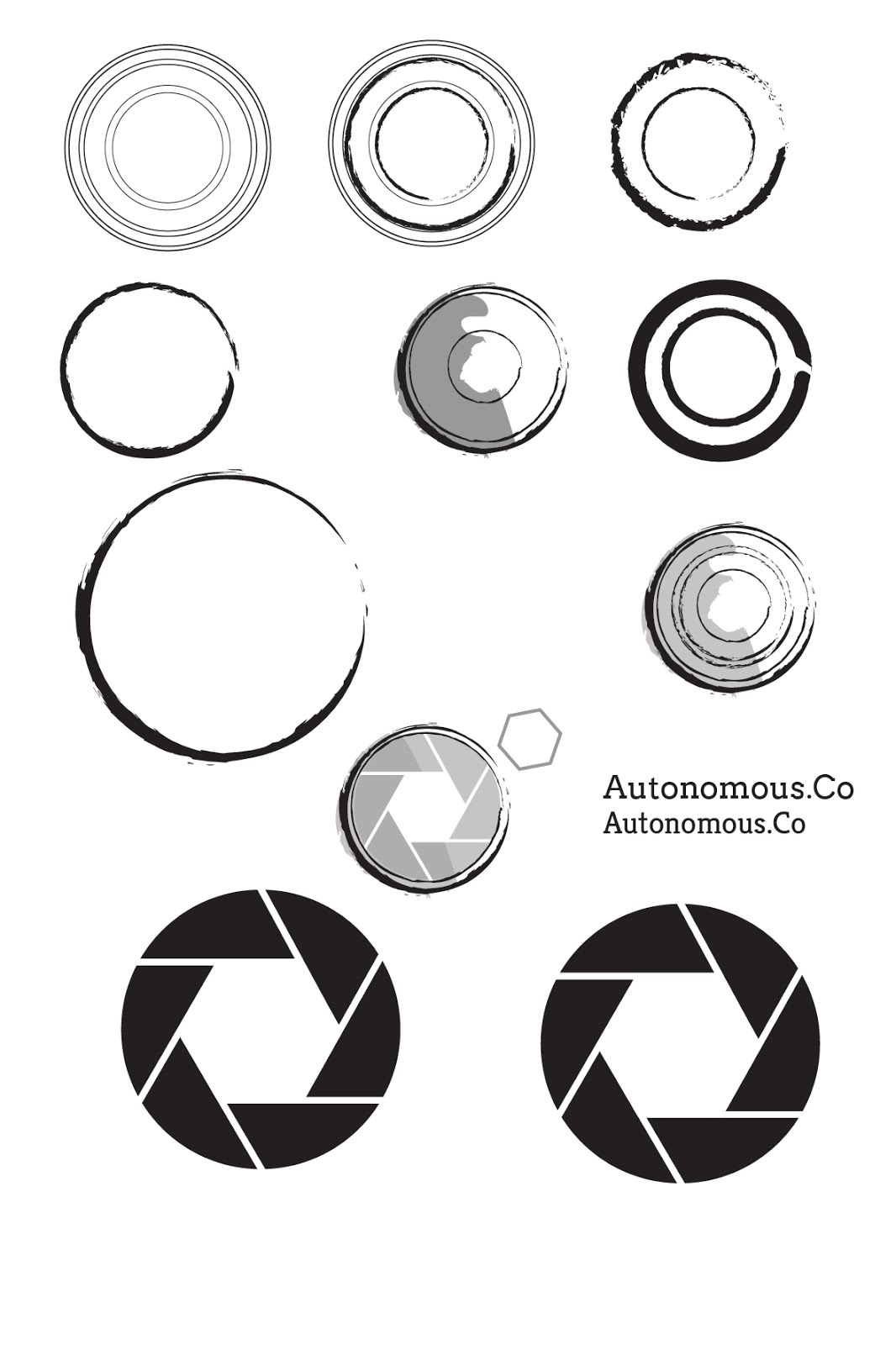
I began by experimenting with circular shapes to represent the camera. I used different artistic brushes to outline the circles instead of a solid line as I wanted to get across the idea of movement. I also wanted to use an artistic outline to make the logo more personal and handcrafted. The plain circles just looked like coffee rings and it wasn't clearly a camera. I simplified a camera's shutter and added this in as an extra dimension, I quite liked the idea of showing a slowed down shutter to represent them slowing down and capturing the lives of people.

I took this idea further and combined it with the camera circles to create the exterior of the camera. I tried out different shutter settings to vary the size of the white hexagon in the middle, as well as different shades of grey to back the image to add depth to the logo. I tried out a range of different 'hand-rendered' fonts to suit the style of the logo but couldn't find one that I liked. The first one (top left) is completely illegible from a distance, it is way too light and delicate, the other two in the top row are too mechanical and they make the logo look like it should be for a car mechanics.
I experimented with another idea of a 10 by 10 grid of circles to represent a legion, people working as one single unit - autonomously. However this wouldn't work as a logo apart from the fact that it doesn't grab your attention it wouldn't work on a scale of different sizes, it would be unclear if it was small.


I was struggling where to go with the logo, I still liked the idea of the circular camera capturing as the logo but it still looked too mechanical. After speaking to Ness we both drew up some different ideas to try moving away from the circlular design I had created so far. In the end I still wanted to use the camera shutter idea but it needed something else to make it more relevant to their company. Ness drew brackets around a circle to symbolise the outline of a camera, I digitally mocked this up and changed the stroke to an artisitic brush.


No comments:
Post a Comment