This was the first of two live briefs as I felt it was important to work with ‘real people’. The clients were clear on the design they wanted so the brief was only 2 weeks long, however I learnt a lot in the process. The clients had some pretty big and impractical ideas, this meant that I had to think about practical (and more realistic) solutions and communicate and rationalise this with them; this was good experience in tactfully dealing with clients. In the way of skills, I learnt a lot about making GIF’s in photoshop - getting it right was the biggest challenge of the project but it was beneficial because it has given me a skill I didn’t previously have.
The final designs consisted of a logo, visual identity, GIF and Youtube banner. The design was pretty straight forward as they had a clear idea before they came to me. This was different from any project I have previously completed because I have always created the concept myself. In some ways it was good experience because I will have to just design things in industry with no say over the leading concept. However I found it hard because the outcome isn’t something I would have chosen and I feel that if I was in charge of the ideas behind the design it perhaps would have been slightly better or at least more conceptual.
Overall, I really enjoyed the brief and although it isn’t my proudest work I am happy that I was able to help someone who needed a brand identity.
Showing posts with label Brief 2. Show all posts
Showing posts with label Brief 2. Show all posts
Monday, 23 May 2016
Sunday, 10 April 2016
Autonomous. Co: Youtube Banner
Ross has contacted me and asked if it is possible to have a banner made for them to put across the top of their You Tube page. I have never made a Youtube banner before but I can't imagine it is too hard.

The dimensions of the banner allowed for the singular images from the GIF to be displayed in a line, this shows the flash developing as the photograph is being taken.

Trying it in black with the idea that it would create a sharp contrast just looks garish and unpleasant to the eye.

One banner with just the logo in the centre isn't eye catching enough, it is bland and unpleasing.


Using the final set of images which show the photograph printing instead. This does create an interesting affect with the image coming out, however I think it is better to use the flash set of images because the yellow adds colour and energy.


Adding yellow to the bottom half of the banner immediately catches your eye and makes the type stand out. The logo has been reversed for the profile picture - this contrasts against the yellow and white banner and is visually more appealing.


A second option has been created which is slightly less in your face and my preferred design. The background behind the Polaroid's has been left white and a yellow strip has been added to the bottom to compliment the flash and highlight the type.
Saturday, 9 April 2016
Autonomous. Co: Editing the Gif

I have been asked to make some amendments to the gif: firstly, to make the picture it prints the logo rather than an outline of a city. Secondly to make the type bolder. After having quite a long break from Autonomous work I decided to make a few more changes to the design and also to how I set up the images.

Firstly I have added a watercolour affect to the Polaroid cameras to make it more visually similar to the logo. The flash has also been changed from white to a yellow cartoon style flash. This is so that it can be seen on a white background, it also helps to add some colour and energy into the design.
I was really happy to change the type to a more readable and clearer font. I chose Bebas as it is bold and has impact whilst still being legible.
Above is the final gif, as you can see I have improved it a lot since the last version. As my software skills have improved I have thought of better ways of creating the gif, for example using the master page of Indesign to keep the Polaroid steady.
Thursday, 5 November 2015
Autonomous.Co: Making the Gif
The guys were pretty clear with what they wanted so that cut out researching for different ideas and lead straight to designing. Originally they wanted this gif to be their logo but I advised them against it and suggested the logo should be a separate, non moving entity, mainly because it would be too detailed and complex for the logo but would work well as a complimentary gif which could be put at the beginning of their videos.


I started by creating a simple outline for a polaroid camera. The polaroid image I created separately and using artboards I was able to move the print out down the screen in equal segments, the rest of the polaroid was deleted so that it looked as if it was being printed. I used Photoshop last year to make a gif so I had a rough idea of what i was doing and how to use the software.

Above are all the separate images in lines so that you can see the progression and what images the gif will use. I quite like this layout in itself as an extra piece of design, perhaps a poster, that could be used to promote Autonomous.Co.
This quick clip was my first attempt, I wanted to make it into a Gif and send it to them before I did anymore to it to check it was along the right sort of lines. Whilst it is a basic rough draft it shows enough to demonstrate the style it would be in.


The simplest way to create the flash seemed to be using a white rectangle that would come out from the flash and grow bigger until eventually the screen is completely white. The shape couldn't have a harsh outline as it wouldn't fit with the design or the nature of the flash, I used another artistic brush to create an outline around the flash which removed the neat, straight edges.

Above shows all the artboards as one, showing how the flash develops and the cuts out allowing the image to print. I used a coloured background so that the flash would be visible.
Here is the final gif, the separate images feed into each other well however I am still unhappy about the images jumping about. I really struggled to line the images up exactly, I am not sure if there is an easier way to do this that I am yet to discover. I send it to them anyway and they quite liked the jumpy nature of the gif, it fits in better with the style of the gif and logo.
Tuesday, 3 November 2015
Autonomous. Co: Logo Research
Before I begin designing the logo I wanted to carry out some visual research into exisiting companies logos to see what it already out there. All the logos work in black and white and involve a simple vector graphic - predominantly a film strip. I really want to try and avoid this look as I feel it has been over done, it is an obvious logo.


Handmade is my favorite logo because of the clever combination of the hands and the film strip to express the company.


Also the logos are neat and clearly defined, I want the Autonomous logo to have a more creative and hand made aesthetic. I feel that this would be more reflective of their practice - it isn't neat and refined it is experimental, messy and creative.
Monday, 2 November 2015
Autonomous.Co: Logo Development

Personal
One of the main qualities that I really like and they were keen to get across is how they are slowing down in such a busy world where we tend to be so fixated on getting somewhere that we don't stop to appreciate the things we overlook everyday. They are taking the time to film someones life and put the light on them, it is personal and builds a rapport with those they film, there is nothing corporate about the company its really about getting to know people.
Fun not Serious
Another factor which I think is important to portray in the logo is that its not serious and corporate; it's two students. However this doesn't mean that the logo should not look professional.
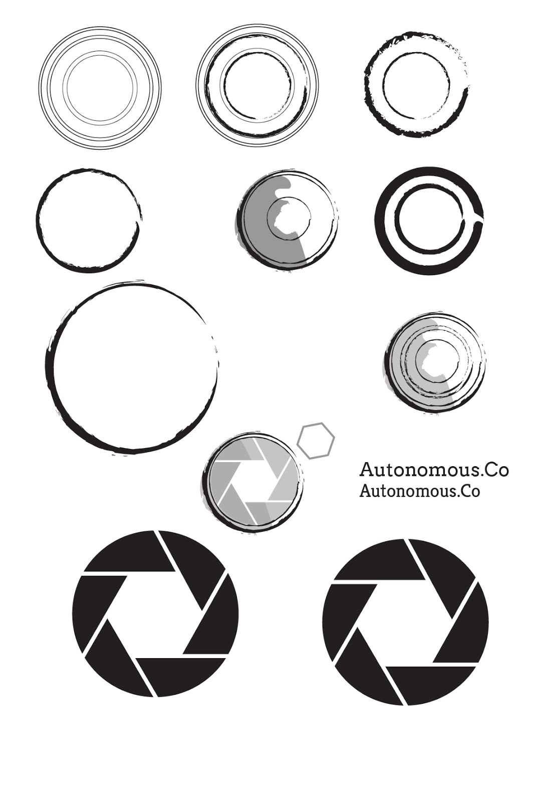
I began by experimenting with circular shapes to represent the camera. I used different artistic brushes to outline the circles instead of a solid line as I wanted to get across the idea of movement. I also wanted to use an artistic outline to make the logo more personal and handcrafted. The plain circles just looked like coffee rings and it wasn't clearly a camera. I simplified a camera's shutter and added this in as an extra dimension, I quite liked the idea of showing a slowed down shutter to represent them slowing down and capturing the lives of people.

I took this idea further and combined it with the camera circles to create the exterior of the camera. I tried out different shutter settings to vary the size of the white hexagon in the middle, as well as different shades of grey to back the image to add depth to the logo. I tried out a range of different 'hand-rendered' fonts to suit the style of the logo but couldn't find one that I liked. The first one (top left) is completely illegible from a distance, it is way too light and delicate, the other two in the top row are too mechanical and they make the logo look like it should be for a car mechanics.
I experimented with another idea of a 10 by 10 grid of circles to represent a legion, people working as one single unit - autonomously. However this wouldn't work as a logo apart from the fact that it doesn't grab your attention it wouldn't work on a scale of different sizes, it would be unclear if it was small.


I was struggling where to go with the logo, I still liked the idea of the circular camera capturing as the logo but it still looked too mechanical. After speaking to Ness we both drew up some different ideas to try moving away from the circlular design I had created so far. In the end I still wanted to use the camera shutter idea but it needed something else to make it more relevant to their company. Ness drew brackets around a circle to symbolise the outline of a camera, I digitally mocked this up and changed the stroke to an artisitic brush.


Sunday, 1 November 2015
Autonomous. Co: Polaroid Research
The guys are pretty clear on the design they want but I feel it is important to carry out some research into Polaroid cameras before I start designing the logo.


I wanted to look at drawings as well as photography because I am wondering whether a hand rendered logo gif would be more appropriate and reflective of the company. However on reflection I don't think it is practical for me to draw it out as it would be far too time consuming.


An illustrative style will be far more appropriate as it will be easier to manipulate on the computer and turn into a gif. The camera is divided into clear sections so this should be easy to recreate however I want the design to have a more artsy hands on effect.
Friday, 30 October 2015
Autonomous.Co: Brief

Subscribe to:
Comments (Atom)