Friday 29 January 2016

Value Range: Chicken!

I have decided to have a roast as my meal, I will then design the packaging for each Sainsburys value range element that would be used in the roast. The roast is a typically British meal where all the family gathers around, this will promote the Savours selection's values of family centricity. Equally a roast is a meal that most families will cook, the final advert for the Sainsbury's savour selection will highlight how cheap a roast can be cooked for for the whole family. This can be used as a selling point - bringing families together
"getting the family together doesn't need to be expensive.....cook a roast for everyone for just £5" or however much it will be.


I begun by drawing my own chicken. I chose to hand draw it myself for a few reasons: firstly in the crit it was made clear that the design should use as few colours as possible to minimise printing costs. By hand drawing it I could keep the design in black and white which would minimise colour but add a lot more detail. Secondly, a hand rendered style is more appropriate because it shows time and effort has gone into creating it; people will subconsciously relate the design of the packaging to the product it contains. Thirdly, a hand rendered style of drawing will be able to applied to every product not just in the roast but for the whole value range.


I have edited the drawing slightly to make it cleaner around the edge (mainly the feet). Using the logo I had designed previously I have combined the two styles. I have copied the cooking information from Sainsbury's website to fill in the gaps. I have left the design with as much free white space around it as possible to make the contrast stronger, I feel it is important to leave white space because this is associated with value products. At the same time, I have made a conscious effort to not make the design look cheap. I want it to fit in with the Sainsbury's over arching brand and appeal to their middle class audience. Whilst this isn't the market that would have to buy value range products I would like to design the range so that it could be seen as a viable, cheaper alternative rather than embarrassing or only for poorer families. After all money saved on food can be spent on the more important things in life.

Wednesday 27 January 2016

Integrity Windows: Compliment slips and Letterheads

I have created a few different potential outcomes by experimenting with different compositions. Whatever style he chooses I will make sure that it is cohesive with the business cards and other stationary to make the brand identity stronger and the same across all aspects.


Compliment Slips

This layout doesn't work because there is information all over the place, it gives the reader no clear order in which to read the information. Taking up the top will really limit how much the owner can write on the compliment slip.


Moving the "with compliments" to the bottom left with the contact information has made the design easier to read.

I then began left aligning the information underneath the logo on the left. This has freed up a lot more room on the compliment slip, it also means that all the information is in one place and has a clear reading hierarchy.


Moving everything to the left hand side could be a viable option as it leaves a lot of space, however the "with compliments" doesn't stand out as much so it is perhaps better off on the right hand side.


Letterheads


Originally I liked the idea of having the logo centrally aligned in the middle of the page. However once I had made it I realised that it wasn't such a good option as it leaves a large amount of empty unusable space either side of the logo. Even making the logo smaller doesn't really solve this, it would still work as a template but its just not the most practical.


I have tried the different logo sizes again but have shifted all the information so that it sits to the right of the logo on the top left page. This looks more official and likely to be sent out by a company as it appears neat and efficient.


These two layouts have got the contact details at the top of the page with the rest of the information opposed to at the bottom centre. I wanted to offer an alternative from having the information separate. In my opinion the information displayed underneath the logo looks best as it fits in with the portrait shape of the page.

Integrity Windows: Business Cards

Since Ray is happy with the logo I want to begin applying it to different business stationery. I decided to start with business cards as they will be fundamental to his business. I have created a few different designs, I wanted to explore the traditional landscape layout as well as a portrait card because it would look different and be more memorable over competitors. As well as designing on both sides of the business card, I wanted to have a few options where all the information would fit onto one side. This will provide a cheaper alternative as it will only be a one side print; for someone who is starting a business up, this may be a better and more financially viable option.


Spreading the information over the two sides means that the logo can be displayed larger to fill the extra space. I like this business card because immediately it is very clear what the company is, underneath the logo I have written Double glazing so that at a first glance people will know what service they provide. The layout is clear and easy to read, the only thing that bothers me is that the logo will not be in the same place when the business card is turned over however I'm not sure if this is a real issue.


This business card has all the information on one side meaning it could just be a one sided card as shown by the design above on the far right. On the back the logo has been made bigger and the company name and slogan has been repeated so that what ever side is viewed first the company name is clear. Underneath I have written "Double glazing you can rely on." Ray could change this to whatever he wanted but I felt it was important to have something explicitly mentioning double glazing. On the whole, people won't enquire further if they aren't quite sure what service the company offers.


The two landscape designs above would be double sided with a smaller logo. This gives more white space around the information and provides a larger white margin, this makes the information look less heavy and the business card is easier to read. I don't like the bottom front card because having everything centred doesn't work when the card is landscape. The information looks squished and the type is too close to either edge of the card, it doesn't fit with the design on the back.


The two designs above would be one side prints, all the information fits in well leaving enough white space to make the type easy and pleasant to read. I have experimented with spacing between the two sets of information and also with logo size to see how it affects the composition of the business card. 

Tuesday 26 January 2016

Integrity Windows: Creating the Logo


After doing my initial research I began playing around with my first design idea. I wanted to keep it minimal and simple so simplified a window and a door down to a square and rectangle. They have been overlapped with a lower opacity so that the outline of each shape is recognisable. The concept of the design was to visually show double glazing (the repeat in shape) and also suggest a reflection which would tie in with the brands slogan. I really wanted to avoid doing a classic window shape as it has been done by every other double glazing company. This logo idea isn't strong, the logo looks weak and fuzzy from a distance because of the double shapes. The logo needs to be clean, neat, and strong so that it visually stands out from a distance. 


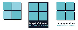
I decided to begin working on a different idea with stronger shades of blue. This idea used the classic 4 squares to make up the window, something that I really did want to avoid. The logo doesn't particularly stand out, it just looks generic and doesn't promote the values of honesty, trust or reliability. Whilst I don't want to use the classic window shape it is important that part of the logo design clearly symbolises a window so that potential clients know straight away what the company does.


I then began working with a basic house shape, I wanted to incorporate a house because it is a symbol of the home - somewhere people tend to feel safe. It also shows that the company deals with the windows in your home, making the companies purpose clearer. The house wouldn't work as a logo by itself but could be combined with other elements to form an appropriate logo.


Going back to the original design, I decided to add a varied stroke around the shapes to make them clearer and almost frame it so that it pulls it all together. This has helped to improve the otherwise blurry logo, however it still doesn't shout out to me nor does it promote the values that Ray wants the design to show.


I began designing in a shield shape as shields represent protection and safety. This shape is perfect for the company as it also symbolises reliability. The logo is strong and clear and relatively simple this helps to reflect an honest and trustworthy business by not being overly complicated or deceptive. 

I sent 6 variations of the two designs to Ray to get his feedback before continuing. He was really happy with the range of ideas and agreed with myself that number 6 was the best design. 


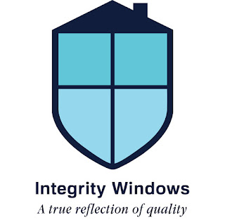
After making some minor adjustments to the bottom of the logo this is the final outcome. The logo works perfectly for what the client is after. It is strong both visually and conceptually, the logo will work with and without the type which makes it more versatile and it will also look okay printed in black and white. Three different shades of blue were chosen to colour the logo, firstly blue is the most logical colour for a double glazing company as it is the most applicable colour to the sky and windows. Secondly, the colour blue symbolises trust and loyalty; these were qualities that the client really wanted to get across as there is a bad reputation in the double glazing industry. I have chosen a font called Familiar Pro Bold for the company name, it is a san serif which is clear and easy to read. It is free for public and commercial use. The secondary italic font is Apple Garamond, I have chosen an italic font to compliment the company name because it will naturally be read second. 

Time Management: Extended Practice Briefs

I want to use Extended Practice to develop a range of skills and different examples of work to fill my portfolio. I want to have a few shorter briefs which will be for clients who need business branding. I feel this is important because in industry I will have to work on briefs that do not interest me and I will not fit in the target market group. It will be beneficial for me to undertake briefs that don't require a 'trendy' design but make me actually think about who the end user of the business will be and how the design would appeal to them. This will also be really good because the designs will actually be used and seen in the real world! 

I want to have longer running self initiated briefs and also set briefs by YCN or another company. One thing that I noticed after looking through a range of job applications was that they need the junior designer to be able to manage smaller scale and longer products simultaneously. By doing a range of quicker client set briefs alongside the longer ones will help to prove I can manage working on several different projects at once.

YCN - The Saucy Fish Co.
http://www.ycn.org/awards/ycn-student-awards/2015-16-ycn-student-awards/briefs/the-saucy-fish-co
I really like the sound of this brief because it will challenge me as a designer to think about shelf appeal and about structural design. The packaging ideally will go straight in the microwave, this will affect how it stands and is dismantled as well as what materials are used to create the packaging. This brief would give me a good opportunity to show conceptual work and detailed sketches as it may not be possible for me to actually create the final outcome so the sketches will need to be clear, explanatory, and accurate.

RSA - Making It Inclusive 
http://sda.thersa.org/en/challenge/rsa-student-design-awards-2016/phase/rsa-student-design-awards-2016/track/making-it-inclusive-en 
The point of this brief is to design a way to enable more people to enjoy the benefits of making. I really enjoy craft and making so I think this would be a brief which I would really get into. The brief offers a vast opportunities for potential outcomes, it is really down to me to interpret it how I want. I feel like people are put of off crafting because of lack of resources and creative ideas, I could create a campaign that uses everyday items that most people will have lying around the house and repurpose them into something creative.

Olivias Deli
This will be a collaborative brief to design packaging and design for a deli bar in Exeter. It will be an interesting brief as it will need a design which not only appeals to the target market but can be applied to a range of different packages from smoothies to sandwiches.  

Value Range
This is a brief I have started already where I am redesigning the Sainsbury's value range. Mainly because I strongly believe that packaging design affects the shoppers view of the product. I want to use this brief to remove the negative associations within basic ranges and show that just because the products cheap doesn't mean its bad.

Integrity Windows
I have begun branding a double glazing company. This is only a short project and should run for a few weeks.

I will also look for briefs that package drinks, health and beauty, and FMCG. 

Friday 22 January 2016

Integrity Windows: Initial Research

The first thing I wanted to do was research into existing companies logo's and general design style so that I would have an idea of the competitors style. I also wanted to look at how they layout information on their website as the client is in need of a website, and whilst I could not code it I could establish a designs style that fits with the branding. I found that only the bigger, corporate double glazing companies like Anglian and Everest had clear designs. Their logos have nothing to do with their service but instead promote the brands values and support the name. Whilst this works for well known nationwide companies, I think that an independent company will need some hint of a window in their logo so that it is clearer to the audience what service they provide. The smaller companies that I have looked into do not have clear or aesthetically pleasing logos, however they are at least trying to represent a window.


Anglian's design is powerful and strong. The white contrasts against the gradient blue background, the logo stands for strength and protection fitting in with the companies name. The website is neatly laid out making it easier to navigate. 


Everest has a similar website structure with a long image across the top and the rest of the page broken up into columns. The logo isn't overly exciting but it does the job and is recognisable. 


Other smaller companies had logos which do not do much to promote the company. The logos look like they have been created on word and there doesn't seem to be much thought behind them.


The Dunraven website is laid out better and whilst the logo isn't amazing it does clearly show what service the company provides. 


Other companies use just type as their logo to keep designs minimal. 

After looking at the other designs I have decided that the Integrity Windows logo should use a visual image combined with type, both elements will need to work as one but also stand strong on their own. Blue will be the best colour to use because visually it supports the company ( blue symbolising sky, windows etc...) but it also symbolises trust, loyalty, confidence, faith and trust; these were all qualities that the client wants to portray in the design.


Thursday 21 January 2016

Integrity Windows: Brief

"At the moment I just have some simple cards made. I am looking to develop a website and branding to run with the business. The business is a double glazing business - installing windows and doors and carrying out repair work. I have called the business “Integrity Windows” and have a strap line that reads: “a true reflection of quality”. My desire is to build a small business that puts honesty, trust and reliability back in the double glazing industry (as you are probably aware double glazing doesn’t have the best reputation)" - Ray

Integrity Windows is an independent double glazing company in Exeter, Devon. They are in need of branding for their business to help promote and advertise their services. The branding needs to resemble quality and honesty, making it clear that it is a small run business which provides an excellent trustworthy service. 

The company will need stationary that they can use everyday such as business cards, letter heads and compliment slips. They may also need flyers and leaflets to promote their business and a theoretical mock up of a website which could be made at a later date.