After doing my initial research I began playing around with my first design idea. I wanted to keep it minimal and simple so simplified a window and a door down to a square and rectangle. They have been overlapped with a lower opacity so that the outline of each shape is recognisable. The concept of the design was to visually show double glazing (the repeat in shape) and also suggest a reflection which would tie in with the brands slogan. I really wanted to avoid doing a classic window shape as it has been done by every other double glazing company. This logo idea isn't strong, the logo looks weak and fuzzy from a distance because of the double shapes. The logo needs to be clean, neat, and strong so that it visually stands out from a distance.
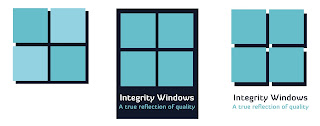
I decided to begin working on a different idea with stronger shades of blue. This idea used the classic 4 squares to make up the window, something that I really did want to avoid. The logo doesn't particularly stand out, it just looks generic and doesn't promote the values of honesty, trust or reliability. Whilst I don't want to use the classic window shape it is important that part of the logo design clearly symbolises a window so that potential clients know straight away what the company does.
I then began working with a basic house shape, I wanted to incorporate a house because it is a symbol of the home - somewhere people tend to feel safe. It also shows that the company deals with the windows in your home, making the companies purpose clearer. The house wouldn't work as a logo by itself but could be combined with other elements to form an appropriate logo.
Going back to the original design, I decided to add a varied stroke around the shapes to make them clearer and almost frame it so that it pulls it all together. This has helped to improve the otherwise blurry logo, however it still doesn't shout out to me nor does it promote the values that Ray wants the design to show.
I began designing in a shield shape as shields represent protection and safety. This shape is perfect for the company as it also symbolises reliability. The logo is strong and clear and relatively simple this helps to reflect an honest and trustworthy business by not being overly complicated or deceptive.
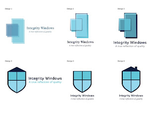
I sent 6 variations of the two designs to Ray to get his feedback before continuing. He was really happy with the range of ideas and agreed with myself that number 6 was the best design.
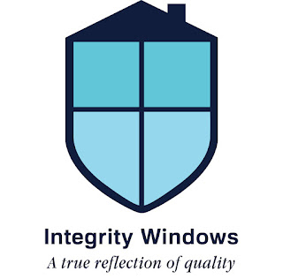
After making some minor adjustments to the bottom of the logo this is the final outcome. The logo works perfectly for what the client is after. It is strong both visually and conceptually, the logo will work with and without the type which makes it more versatile and it will also look okay printed in black and white. Three different shades of blue were chosen to colour the logo, firstly blue is the most logical colour for a double glazing company as it is the most applicable colour to the sky and windows. Secondly, the colour blue symbolises trust and loyalty; these were qualities that the client really wanted to get across as there is a bad reputation in the double glazing industry. I have chosen a font called Familiar Pro Bold for the company name, it is a san serif which is clear and easy to read. It is free for public and commercial use. The secondary italic font is Apple Garamond, I have chosen an italic font to compliment the company name because it will naturally be read second.


No comments:
Post a Comment