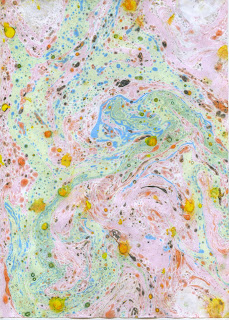
I wanted to create my vinyl cover in a similar style to Tame Impala's artwork, this is so that it fits in with the other albums but also so it is reflective of the song. I chose to experiment with marbling paper because it would create unique designs each time, they show movement and colour which is something I really wanted to visualise in the design.
After creating a range of different marbled outcomes I decided to work with the one above. I chose this one because it had a good range of colours and patterns, some of the other designs were quite weak visually where as this one had a lot going on.
In photoshop I was able to boost up the brightness and strength of the colours to make the design more visually exciting.
I
cropped the design down into a square format and then duplicated it 7
times but each time decreasing in size and rotating once clock wise.
This created the squares and a more interesting dynamic because the
pattern changes opposed to if they all remained the same way up. I then
selected alternate layers and adjusted the colour to make it more of a
blue turquoise. I did this so that the layers would be clearer and
easier to differentiate, it has also given more depth to the album
artwork.
Finally
I decided to warp the layers in Photoshop to create a ripple affect
forming from the middle, this has mixed up the colours and layers making
the design look slightly 3D.
Overall
I am really happy with the outcome, I have never given myself such a
short time frame for a brief and I feel that I have been able to create a
fitting design. The song is about a boy finding out the girl he is in
love with is in a relationship, visually the bright vibrant colours
symbolise the feeling of being in love - his world being full of life
and happiness. The ripple starting in the middle resembles his loved up
world being shaken and disrupted. In the end I just wanted to create a
visually pleasing and interesting design that people would want to own.


No comments:
Post a Comment