I chose this brief because I wanted to take part in a Starpack competition brief; they are packaging based and this would help expand my packaging skill set. I decided to redesign the packaging for Walnut Whips with the aim of creating a more efficient and more appealing design.
This was the first brief where I’ve had to design packaging for food, this in itself taught me a lot as I had to consider packaging shape - what would be most protective and suitable as well as considering the physical appearance of the package.
I also developed my photography skills as this was the first project where I was really happy with the final photographs. I began considering the background more and framing the product to give it a stronger impact; simply adding a yellow background and walnuts really helped to bring the packaging to life. This got me thinking a lot more about photography and how I choose to present my work.
After entering the competition and receiving a commended award I decided to extend the project by creating an advertising campaign with the aim of bringing Walnut Whips back on the publics radar. I really enjoyed the challenge of coming up with a concept and exploring ways of showing it through different formats of advertising. This extension brought to light my interest in copy writing and with that expanded my skill set.
Overall this has been my favorite project as I have learnt so much. I approached this project with the mindset of going into industry which made me want to increase my skill set by thinking about more than just the packaging, and considering how the Walnut Whips would be promoted.
Showing posts with label Brief 4. Show all posts
Showing posts with label Brief 4. Show all posts
Monday, 23 May 2016
Monday, 9 May 2016
Nestlé: Dare to Share?
Another concept for a promotional poster - Dare to share? After creating the "one for you, one for me, one to argue over" it got me thinking about the whole sharing aspect especially because there are 3 of them. Dare to share implies that the Walnut whips are that good that you might not want to share them - you wouldn't dare to share!


Originally I wanted to have the three walnut whips in a row with someone pinching one. However the images of the Walnut whips don't sit quite right on the background. This poster will be part of a much larger campaign so I don't think it is necessary to have a picture of the walnut whip on everything - instead the posters can have elements which hint at the chocolate snack.

Instead of using the clumpy walnut whips I have created a falling walnut background. This works much better because the walnuts fit the shape and fit around each-other better to visually appear as if they were falling. This also means that the type is the centre focus which adds more emphasise to its message.

I have introduced a blue bar across the bottom to replicate the first poster. This provides a separate area for the brand name and picture whilst still being part of the design. The picture of the packaging above doesn't stand out from the blue bar, it hard to see as it just fades into the background.

Keeping the blue bar but removing the packaging image has really helped the design. Walnut whips are back gives the viewer enough information to understand what the poster is talking about but a level of intrigue is still there.

Here is how the poster would look in reality. It would be displayed in billboards to catch passers by. The whole campaign uses this strong yellow and blue contrast to unite the strong impact campaign and be in keeping with the packaging. This visual aesthetic means that all the designs are immediately identifiable as Walnut Whip.


Experimenting with the positioning of the Nestlé logo - it was important to include this seeing as this is the brand!! Plus I think people will view the designs like 'ooh Nestlé' I guess it adds reliability and reassurance seeing as they are a big brand name. The logo looks better on the bottom right because then it is out of the way but still there - it is not distracting from the main message.
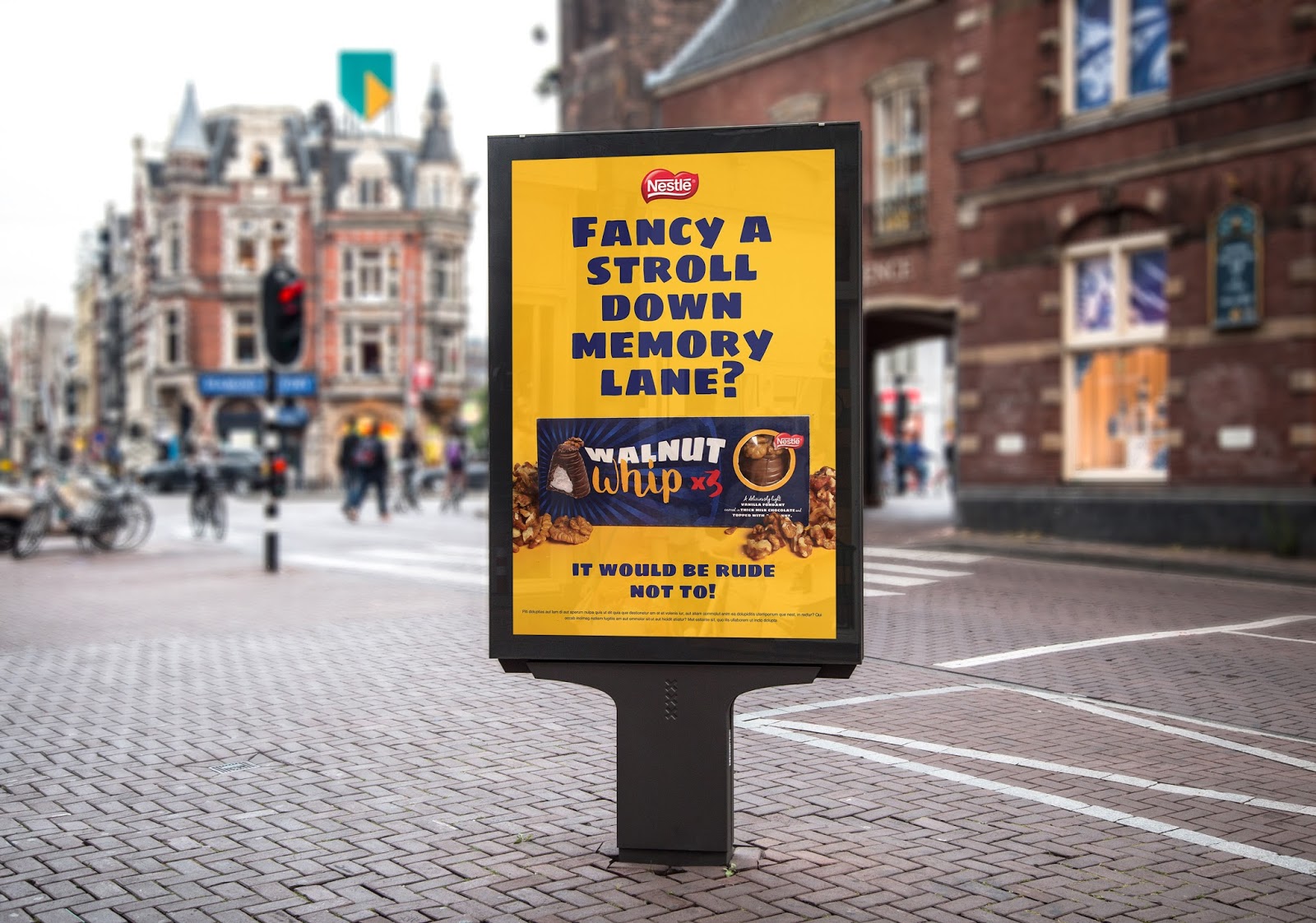
WARNING: may cause nostalgia
Another poster idea promoting Walnut Whips history. A lot of people used to love walnut whips and have fond childhood memories of them. Seeing as they haven't been around for a long time I like the idea of reintroducing them into society with a nostalgia warning: in a way this advertises them through people's memories, people want to feel nostalgic and reminisce!

Originally working with the blue background and having the walnut whip on a separate board. Whilst this catches your eye the two designs could be promoting completely different things - there is no clear way that the designs are linked.

Changing the background to yellow makes the two designs consistent. I am going to remove the blue bar and change the walnut whip type colour to red or blue I think this will further help to link the designs.
Nestlé: Final Advertisements
Here are the final advertisements for Walnut Whip, I have really enjoyed extending this project out and considering more than just the packaging. It has been a very useful experience to think about other platforms and how the designs would work in different spaces. Coming up with the concept and how the campaign would work to promote the packaging has been challenging but enjoyable, I am happy I have done it as it will show that I have skills beyond just packaging and that I can think conceptually.


Tuesday, 3 May 2016
Nestlé: Campaign


I have begun designing some posters for the campaign to reintroduce Walnut Whips. I want the posters to correspond and compliment the packaging as this will add continuity to the cross over of designs. Out of the three main fonts I used for the packaging I am going to use Sigmar one (middle) for the poster statements as it is the clearest and easiest to read from a distance. The Starpack brief was around shelf impact and what stands out, for this reason I think the campaign needs to be bold and in your face so that it has impact.

Using an image from the photoshoot of a Walnut Whip I placed it in the centre, the increasing blue line background has been copied from the packaging in order to match and also draw the eye into the WW. The statement 'I'm back' announces to the world that walnut whips are now back and better than ever. Already I am liking the contrast between the type and background.

The walnut image was uneven so using photoshop I have duplicated the nuts on the other side in order to balance out the image.

This has made a big difference as it has stopped the design from being lop sided.

The type has also been centralised and split so that it fits better around the image. Having 'I'm back' in the central middle grabs the viewers attention, the extra type has been moved below the walnut whip which has balanced the design and means it is read separately to the primary statement. Adding the image of the packaging at the bottom left shows people what the packaging looks like which will help the products recognition.

I have mocked up the design onto a poster advertisement to see how it would look in reality. The colours create a bold and vibrant contrast which is guaranteed to catch your attention. The statement "I'm back!" has an extremely clear meaning, when viewed from a distance the message of the poster is understandable - the viewer would only have to see the chocolate and the statement and realise that Walnut Whips are back on shelves.
BUS
One idea that was sparked from a comment from a lady in a forum who said her and her husband will have to fight over the 3rd Walnut Whip. This introduced another interesting marketing angle - the one left over. "One for you, One for me, One to argue over..." highlights the majority of relationships where you will bicker or argue for the last bit of food, or maybe thats just me?! Anyway, the statement is fun, light hearted and engages the audience. The advert has been left intentionally without any branding i.e the name or logo because the Walnut Whip itself is iconic enough to be recognised. Even if people don't know what the adverts for it will create intrigue.

2nd Poster
A second poster was created around the idea of being transported back to childhood. One comment from a man saying how Walnut whips take him down memory lane sparked my next design. I knew I wanted to do something based around nostalgia which got people to reminise however this wording pulled it all together.


A few experimentations with the follow up statement "it would be rude not to!". The font Cheddar Jack which has been used to compliment Sigmar One on the packaging breaks up the design and adds a hand rendered element to the design. However the r in 'rude' looks more like an S which causes it to be misread. The white type definitely stands apart from the blue type but perhaps too far out? My eye is drawn to the white type and I ignore the other information and box! Decreasing the secondary statement helps the type hierarchy meaning the viewers eye reads the top statement first.


A blue frame? Nope. Makes the design look caged in and refined which doesn't particularly fit with the bright colours and the brands personality.


I tried making the first statement bigger to see if this was visually more pleasing, however I think having the type bigger suddenly gives the eye more space to cover making the design less pleasant to look at.


Making the type smaller has really improved the designs appearance. Overall I am really happy with the poster outcomes so far as they fit in well with the campaigns concept and the packaging's visual identity. I have applied the poster to a magazine spread and a bill board - two very likely places for it to be displayed. The design is bright and engaging, it is all a bit of fun and shows the brands upbeat and lighthearted personality. One thing I will add is the Nestlé logo as this will help increase sales if people see it is a 'trusted' brand.
Monday, 2 May 2016
Nestlé: Advertisement Research
After the WPA Pinfold portfolio review they said it would be interesting to see an extension of the Walnut Whip packaging - how it would be advertised. I thought that this was a great idea, I enjoyed the project and managed to get the best photos I've ever taken so it seems like a good opportunity to put them to use. Before beginning designing I want to research into a few different promotions for other chocolates to see what they do, how it is laid out etc...


The cream egg advertising has always been iconic, the packaging has rarely changed but it is the advertising that brings them to the forefront of everyones minds. The adverts play around with the fact that they are only around for part of the year creating a sense of urgency - get one quickly! The slogans all emphasise this point - 'have a fling with a cream egg' well a fling automatically resembles a short period of time. 'Here today, goo tomorrow' a clever play on words with goo relating to the inner egg but also to the word 'gone' suggesting that they will go quickly! People will eat 'em!

Simple but clever. The advert shows exactly when you would have smints - when you want to appear your best. The small bowtie uses the shape of the packagings dispenser to create a shirt which is associated with looking good as well as formal occasions. The lighter coloured background and white faded light keeps the viewers attention on the packaging and its promotional message.
Campaign Concept
After looking into a couple of different confectionary campaigns I want to start narrowing down what direction the Walnut Whip campaign should take. I read through a lot of thread boards about Walnut Whip to see what people are/were saying about them. I found some interesting comments on Yahoo Answers which got me thinking about the campaigns concept.
Firstly, the main argument or issue with Walnut Whips seems to be that the receipe has changed so much since when people first had it as a child. I've done some research and yes the reciepe has changed as it has changed companies and production has shifted from a smaller scale to mass production. The campaign could focus on resolving this issue, my first ideas are some kind of jokey statement like "..and you haven't changed over the last 20 years?" highlighting the fact that we all change and develop but applying this human charactersitic to a chocolate product.
The campaigns main purpose should be to re-introduce the Walnut Whips back into society, after all the reason I originally chose to do Walnut Whips was because they weren't sold in supermarkets. This will be the backbone of the campaign and should firstly re-attract old lovers of Walnut Whip and secondly appeal and intrigue a newer more contemporary audience. "quickest way back to childhood" although not that slogan, something better but along those lines promoting the idea of reminising via walnut whips.
Wednesday, 16 March 2016
Nestlé: Starpack Submission
The Starpack submission required a physical entry was sent in accompanied by 3 design boards. Below are the design boards I sent. Unfortunately I came down with a severe case of the flu before the deadline so I wasn't able to get photographs of the product, I think this would have really boosted the submission especially since the brief was about shelf impact. However whilst it is a shame I believe what I have submitted has been substantial.


Along side the practical outcome and 3 design boards I also needed to submit answers to a few questions:
Why is your design a winner?
My design is a winner because Walnut Whip's are one of Nestlé's oldest confectionary products and they are no longer sold in mainstream supermarkets. My design refreshes the Walnut Whip image so that it appeals to both adults who loved Walnut Whip's as children and people who have never tried it before.
What were the key challenges?
The key challenges were to design a better structured packaging which uses less material but presents the product in a more attractive manner. Visually the main challenge was to evoke a feeling of nostalgia amongst an older audience whilst also tempting new customers to try a delicious Walnut Whip.
What was the solution?
The solution is a sturdy triangular box which uses a minimal amount of glue to assemble, it opens up allowing the consumer to share the Walnut Whip's with friends. The design uses rich dark blue tones as a backing in association with the original packaging to create a feeling of nostalgia. Contrasting colours and fun fonts have been used to give the product life and a personality.
How have you met the judges criteria?
I have met the judges criteria by creating a design with a strong shelf impact. The innovative packaging considered the shape of the chocolate and worked around what would fit it most efficiently and effectively. The packaging has been designed to use a minimal amount of glue but still provide a strong, sturdy structure which would survive transportation and look great on a supermarket shelf.
Tuesday, 15 March 2016
Nestlé: Photoshoot
The photoshoot overall was very successful, instead of loading up all the images I have selected a handful.


I made sure to get a few photos of the original packaging as this is something I should really show so that people get an idea as to how the design has changed.


I tried photos on a few different bright colours, both red and blue were okay but in the end I decided to go with yellow as this complimented the blue the most and really made the packaging pop out of the image.


The yellow background really does work best and the addition of walnuts has really helped to frame the product and bring the image together.
Subscribe to:
Comments (Atom)