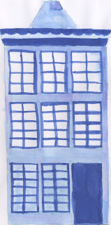
After doing some visual research I wanted to really quickly sketch the style I want to create to get a bit of practice using the inks and also to have something to refer back to when it comes to drawing the final outcomes.

The first 3 houses I drew (left page) don't look like Dutch houses, the height needs to be excenuated to really show off the classic style archietecture. The drawing on the right has had another floor added to be a more accurate reflection of the houses. The drawings should be simple as they are going to be printed relatively small - if there is too much detail then the design will become overaly complicated.
I really like the idea of using gentle colours to fill the houses, however I think I will paint the outlines first in black and scan them so that I can create a black and white alternative before playing around with colour digitally.

No comments:
Post a Comment