After drawing up a quick idea for the back of the box I wanted to start designing and get the box close to finished so I have time to refine and make changes before the print slot.


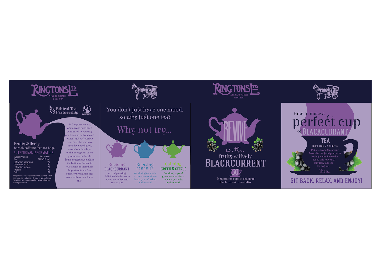
I wanted to keep working with the simple silhouettes as this is a clearly defined style for the box. I love the idea of the tea pot pouring out tea, using a lighter colour provides a good background for the information about Ringtons fair trade. The fairtrade and ethical tea partnership logos have been placed at the top of the design - I felt this was an important aspect to include because it evidences their care for the environment and those who work in the tea industry, this will be a big selling point to the educated audience.

I am really happy with the back now, however it feels like each side is different - they could be different products! I think my main issue is with the 'why not try...' side as there seems to be no good way of fitting the tea pots and corresponding information in against a clashing background.


The information looks best and stands out on the navy blue background, however adding the blue in a bar really breaks up the design when it needs to flow as one.


The information and tea pots still look unclear - they will be hard to read when printed. I've decided that to try and solve this issue I will adjust the colour palette.

I've picked three colours for each flavour in different tones to provide contrast.


I've started to apply the new colour scheme to the Peppermint box. I have reogranised the tea pots so that they are in a horizontal line with the information underneath - this has made a huge difference as the information is easier to read and the designs fit better into the space of the side. Changing the tea pot colours to match the main box colour has made them fade into the background - I think it is important to use the colours of the flavours so that they become synomous.

Changing the tea pot on the front to match definietly doesn't work - it may be pretty and dainty but it just wouldn't stand out on the shelf or anywhere! There needs to be the darker blue to add contrast and really make the main colour pop out. Using the darker colour across all the boxes will also add continuity to the designs and it will make the differences more significant.


I wanted to see whether extending the pouring tea over the 4 panels would work. My thought being that it would join all the sides together and also look interesting when photographed (all four boxes could be lined up showing a different side). I love the idea but I still think the design looks weak although this is primarly down to the lack of colour contrast.

Keeping the pattern but making the front background darker makes the tea pot stand out but again, the designs don't look like the same box.

A darker background works a lot better as the type stands out. However it doesn't work on the far right panel as it limits the space for the typography.

The far right design should be left with the lightest colour as the background. This is the clearest layout. Overall I think the design has really developed and is definitely getting there. I am still not happy with how the other teas are promoted but this is something that can be edited.
Applying the design style to the other teas:


No comments:
Post a Comment