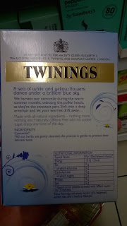
I wasn't too sure what to put on the other sides of the box and since Ringtons isn't really sold in shops I decided to look at what other brands have written on each side. This seems like a good starting point before beginning to draw up layout ideas.
Clipper's tea has a lovely illustrated style to it, creating shapes to limit the type too really lets the design speak for itself.
A description of the product and a list of it's ingredients will have to go on the back.
How to make the tea is a good idea for one of the sides. It could also be a good space to promote the other products in the range - after all people have more than one mood so why not more than one tea.
Including where the tea comes from or how it is sourced is a good idea. The history of Ringtons could go on one side to promote the historic quality and promote the brands tradition.
Sides:
• How to make the perfect cup of tea
• Other flavours to try
• The history of Ringtons
• How the tea is chosen...
• Ingredients and description


No comments:
Post a Comment