After coming up with a few conceptual ideas to guide the design I have begun sketching out how the design could look and be applied to a range of teas. The concept I have decided to develop first is the 'Always a Ringtons for you' where the product is sold on how the individual wants to feel. After writing my dissertation and learning about appealing to consumers emotions over rational reasoning, I really wanted to have a go at implementing this in a project.
The idea behind it is that the main feeling associated with the tea would be shaped to fit inside a tea cup. The tea cup shape and colour would be different for each tea but the general design aesthetic would remain the same. This will unite each tea under the same brand, but again enough differences to tell them apart and make them individual in their own right.
Beginning to create the design, shaping the letters to fit inside the cup. The type should compliment the colour of the mug - the R for example is a nice colour but it is almost impossible to read up close let alone from a distance.
Adding in a handle as well really throws the design off as it is a lot thicker than the type so it detracts the attention from the word.
Leaving the handle out works a lot better as the design is much more legible and pleasing to look at.
I have begun changing the colour scheme to see how the overall design would look.
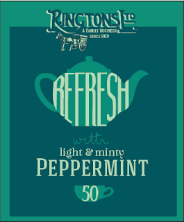
A sudden brain wave: using tea pots to display the word instead of a cup would work a lot better! The tea pot would provide more space for the word to be shown, not too mention it feels more British. I really want the design to have a British aesthetic as it is a family run british company. The design should have classic British elements whilst being contempory and attractive to a modern audience. Changing from a cup to a tea pot also means that the cup can be used on the design to show how many tea bags are in the box - a much more appropriate symbol.
Using a tea pot has given the letters a lot more space which will ultimately make the design easier to read when its on a shelf. However having high bar of the e's and f makes the letters harder to distingush.
The bars have been lowered so that they are in line with the centre of the tea pot, immediately this makes the whole design easier to read.
The colours for the design whilst peppermint-y are quite weak - they don't provide a big enough contrast to stand out or catch your eye from a distane. Above a darker blue has been added to the word peppermint to make it pop from the box.
This then lead me to trying the darker blue as the background colour which has helped the design to stand out. Leaving a green frame around the edge compliments and frames the tea pot whislt also reemphasising the tea flavour. The logo has been created in two colours to create a drop shadow, it creates a hand painted sign affect which evokes a feeling of British heritige. The logo doesn't seem to stand out in either colour - perhaps it needs to be a set colour that is rolled out across all the designs.
I decided that the blue should be richer, a royal british blue to promote the English history of the product. Using sample colours from the British army a darker, more traditional blue has been used for the backing strip.
The darker blue has made the design elements stand out even more, it is definitely starting to take shape now. The dark blue will remain the same on each design but the complimentary colour will change to promote the product.
After reaching a point where I was happy with the design composition I decided to mock up a second box of a different tea so that I could visually see how the design would work across the range. I am really happy with how the designs are looking; the colours compliment the product and its main qualities, the type is read in the correct order and the designs look like they are part of the same family but work on their own.
A lid would be added to the top which would have the logo on the sides - this would then overlap the part of the design with something written underneath although this is yet to be decided.
I began applying the design style to a third tea. This design still needs a lot of work - I think the colours are too dark they need to be more inviting and engaging especially because the tea is supposed to liven and revitalise you!


No comments:
Post a Comment