

A very quick and rough cut out of the packaging just to see what it would look like in a kitchen setting. Whilst I like the idea of using a plain white background to fit in with the no nonsense, straight talking brand, I also want to explore using a kitchen background to help people imagine the range in their home. Using a nice kitchen will hopefully help to remove the connotations that the value range is only for poor people or students, and replace it with the notion that the value range is for anyone who wants to save money for the more important things in life.

Going back around the picture and using the anchor tool to accurately cut out the background.
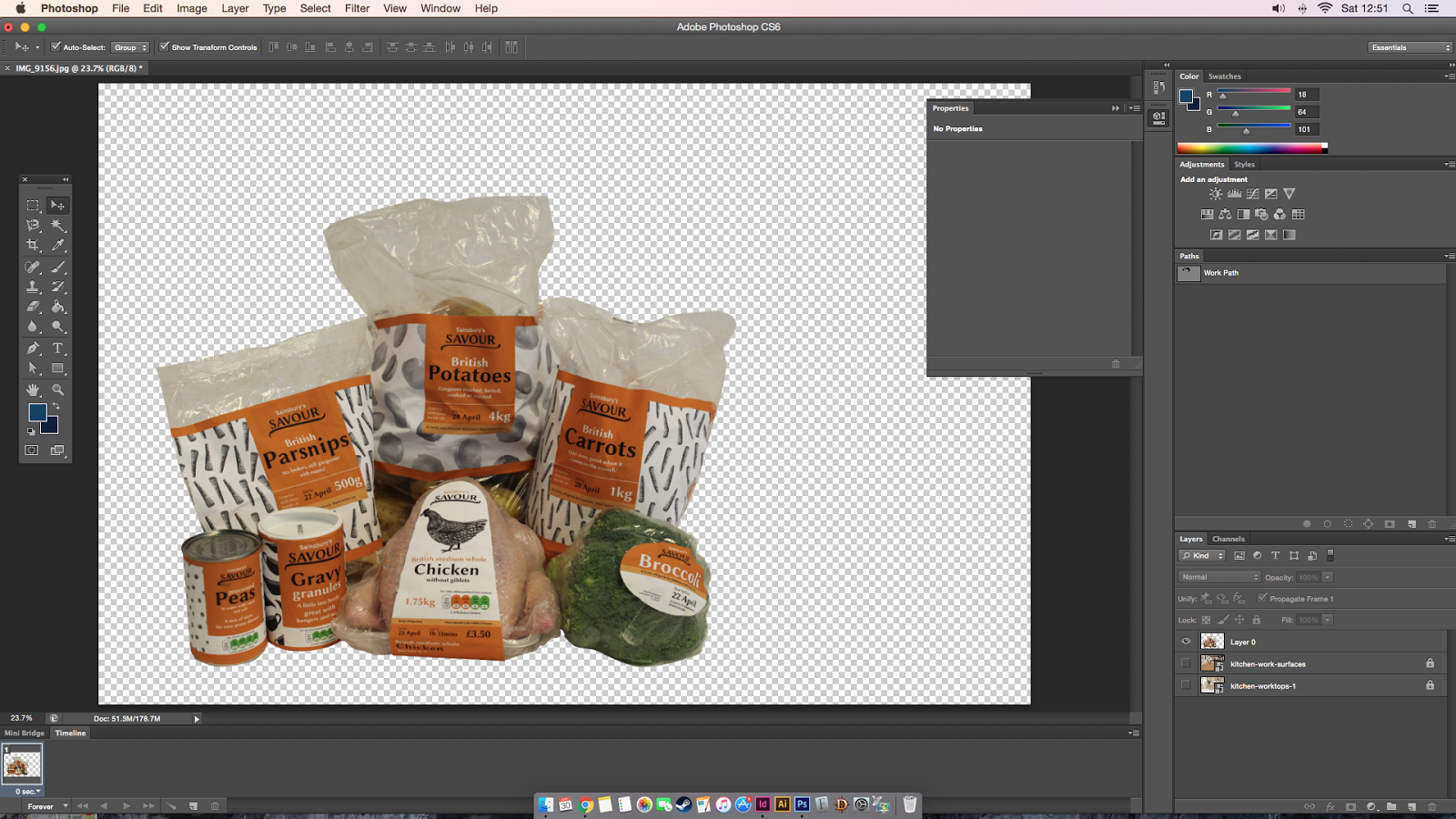

The products look a lot better in the kitchen with the edges neatened up.


Adjusting the brightness and contrast makes the products look more natural in the kitchen setting.

I added black underneath the range to create a shadow in an attempt to make the products look more grounded to the counter opposed to being photoshopped in. A Gaussian blur makes the shadow gentler and more realistic.


Moving the design into Indesign allowed me to use grids and easily create separate layers for the type and background. I decided to add in an orange background because the type wouldn't be clear directly on top of the busy image.


Experimenting with type layout and colour, the white jumps out at you.

Changing the colour to match the Sainsbury's orange and the tint that was used on the packaging has made the design a lot lighter. I have changed the colour of the type so that Bring the family together is in white as this is the new Savour positioning - all about family centricity.

Adding in how cheap it is to promote the second point - saving money for the things that matter. I am not sure if it is £2 each, its probably less if you are just counting the veg you use (I can't imagine anyone uses 4kg of potatoes for there Sunday roast). This information works better bold and big on an orange background as it will be a huge selling point and should be clear. However I don't know if having it in its current position works well because the £2 distracts from the informative type on the right and the products.

Moving the price to underneath the sign definitely makes the design easier to look at however I think the information needs to be bigger so that it catches peoples attention.
Plain Background
I have simultaneously started mocking up a vertical poster with a plain background. Working in this layout means there is a lot more room for type as it is not constricted by an orange box allowing it to be bigger and more in your face.


The white and orange background immediately identifies the poster with the Sainsbury's basic range which would work in the favour of the campaign. It simplifies the design down so that the focus is purely on the products and the campaigns message. The type works best on the orange background as the colour makes it easier to read.
No comments:
Post a Comment